
-p-130x130q80.png)
Welcome to the third chapter of The Complete 2023 Beginner's Guide to Power BI. If you're just starting out with Power BI, we recommend reading the first chapter “The Complete 2023 Beginner's Guide to Power BI”, which provides basic overview of Power BI, including how to connect to data sources, create simple reports, and visualize data. For those looking to master the basics of the DAX language used in Power BI, we recommend checking out our second chapter, "The Next Power BI Guide with DAX formulas and date tables".
In this chapter, we will focus on design tips to make your Power BI dashboards stunning and effective. By following the tips we provide, you will be able to create dashboards that are visually engaging and help you gain insights from your data. Let's get started!
Dashboard design is crucial for effectively communicating data insights to stakeholders. A well-designed dashboard can provide users with a clear and concise understanding of their data, allowing for informed decision-making. In addition, a user-friendly interface is essential for making sure that users can easily navigate and understand the information presented. While Power BI provides a solid foundation for creating reports, its initial settings and designs can be bland and unengaging. By utilizing the six design tips we'll be discussing in this chapter, you can transform your Power BI dashboards into stunning visualizations that are both informative and visually appealing. So, let's dive in and explore these design tips!
1. Pick a Color Theme and Font Style
If you're looking to create a dashboard that's both visually appealing and consistent, the first thing you should do is set up a theme for your Power BI dashboard. By applying a theme:
- Consistent use of colors and fonts throughout the dashboard design
- Saves time by avoiding the need to individually tweak each chart or visualization
- Well-designed and consistent theme gives the dashboard a professional look
- Easier for users to understand and interact with data presented on the dashboard
Adjust your themes as follows
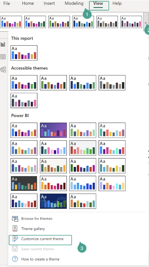
- Select the View option from the Menu Ribbon
- You could either select an option from an existing theme
- Or you could customize the theme as you like. If you want to customize your theme. Select Customize current theme from the bottom section of the theme menu
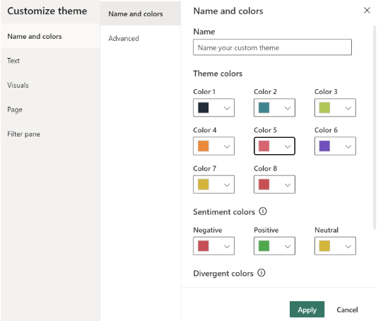
- In the Name and Color Section, Add your brand color or the color of your choice. Make sure to select at least 5 different contrasting colors that are distinctive from each other
- If you're struggling to choose color themes for your Power BI dashboard, don't worry! There are some awesome websites out there that can help you out. These sites make it super easy for you to pick the perfect color theme for your dashboard. (https://coolors.co, https://www.color-hex.com, https://paletton.com)
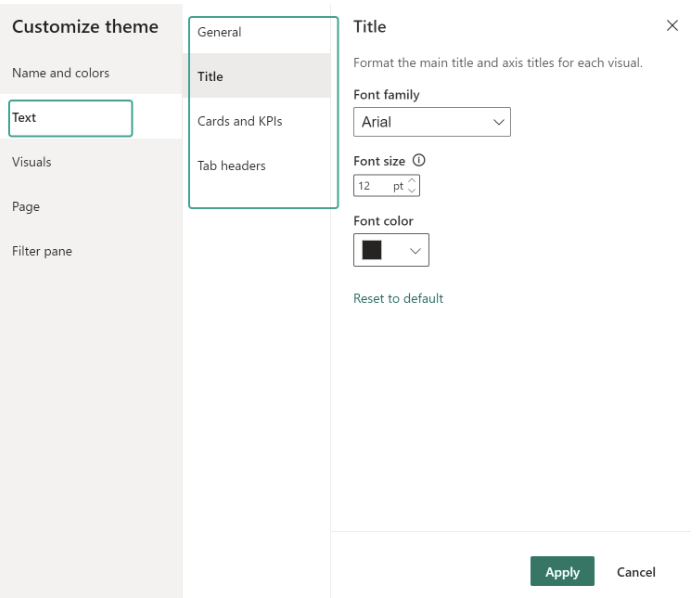
- Next, Select Font style and size for your dashboard
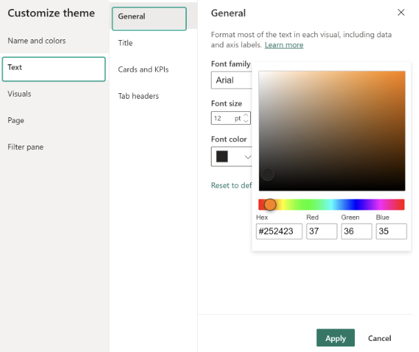
- Follow the same step for other visuals - Tiles, Cards and KPIs and Tab Headers
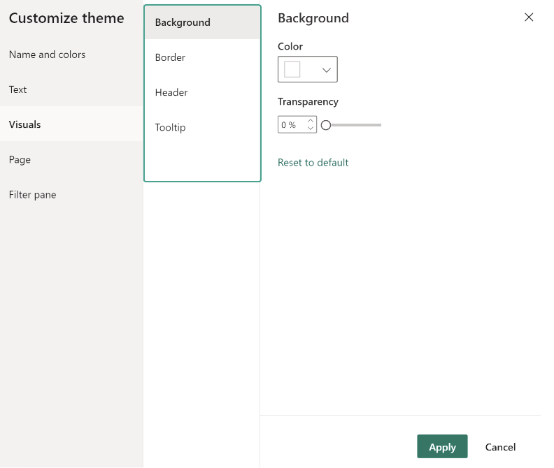
- You can also adjust the background color, border, header and tooltip accordingly
- Bonus Tip: To be honest, the default font choices in Power BI can be a bit outdated and boring. But don't worry - there's a solution! By importing custom fonts, you can give your dashboard a unique and attractive look that's consistent with your brand. Check this helpful blog, where you can learn how to import custom fonts into Power BI. The steps are explained in a clear and easy-to-understand way, so you can get started right away
2. Use Alignment tools
A good design should have balance and perfect alignment. Alignment tools are crucial for creating a visually appealing dashboard. Use the alignment tools in Power BI to ensure that all your visuals are properly aligned. This will help to make your dashboard look professional and polished.
Follow these steps to align your charts in Power BI
- Select a chart you want to align
- Select Format from the menu Ribbon
3. Adjust multiple visuals in one go
Instead of adjusting each visual separately, use Power BI’s ability to adjust multiple visuals at once. This will save you time and ensure that all your visuals are properly aligned and sized.
After multi-selecting, just head to the visual editing area and adjust what you want. In most cases, your new settings will apply to all visuals.
4. Use Icons
Icons are a fantastic way to quickly convey information in a visually appealing way. By using icons, you can give your dashboard a more polished and professional look. Plus, icons can be used to represent buttons or links, making it easy for users to navigate your dashboard.
The good news is that you don't need to be a graphic designer to add icons to your dashboard - you can find tons of license-free icon images on the internet. Simply download the image you want and upload it to Power BI by clicking the 'Insert' option and selecting 'Image'. Then, resize the image to fit your needs. It's that easy!"

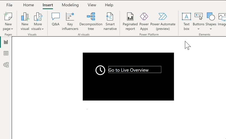
5. Use buttons to make the dashboard dynamic
Using buttons can be a great way to make your Power BI dashboard more dynamic and interactive for users. Buttons can help you maintain a clean and structured navigation bar, which is essential for a good user experience. By creating buttons that serve as both buttons and navigation menus, you can keep the dashboard organized and intuitive to use.
Fortunately, creating a button in Power BI is a simple process. To get started,
- Click on the 'Insert' tab
- Select 'Button' from the menu, choose the 'Blank' option to create a new button from scratch
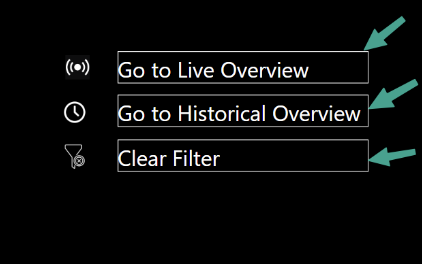
- Once you've created a button, you can customize it to suit your needs. You can add a name to the button, change its border style, or add other visual elements to make it more appealing
6. Keep it Simple
When it comes to designing a dashboard, simplicity is key. It's important to remember that the primary purpose of a dashboard is to communicate data in a clear and concise manner. Cluttering your dashboard with too much information can lead to confusion and overwhelm the viewer. Instead, focus on a few key metrics that provide the most value to your audience.
In addition, it's important to avoid using too many colors or flashy visuals. While it may seem tempting to make your dashboard stand out with a rainbow of colors, it can actually distract users from the overall message and make it harder to read. Stick to a consistent color scheme that is easy on the eyes and makes it easy to distinguish between different data points.
Furthermore, if you’re eager to elevate your mobile dashboard design, don’t miss the opportunity to explore the article ‘Designing an Intuitive Mobile Dashboard UI: 4 Best Practices’ on toptal.com. It’s a helpful guide to keep your dashboard clear, user-friendly, and visually appealing.
Conclusion
In conclusion, by following these 6 design tips, you can make your Power BI dashboard stunning every time. Remember to pick a consistent color theme and font style, use alignment tools and adjust multiple visuals in one go, use icons, buttons, and keep your dashboard simple. By applying these tips, you can create a professional and visually appealing dashboard that effectively communicates your data. So, go ahead and apply these tips to your Power BI dashboard today!
Further Links
This post is part of the Complete Guide to Power BI Data Analytics series from datadice and explains to you every month the newest features of Power BI.
Check out our LinkedIn account, to get insights into our daily working life and get important updates about BigQuery, Data Studio, and marketing analytics
We also started with our own YouTube channel. We talk about important DWH, BigQuery, Data Studio, and many more topics. Check out the channel here.
If you want to learn more about how to use Google Data Studio and take it to the next level in combination with BigQuery, check out our Udemy course here.
If you are looking for help setting up a modern and cost-efficient data warehouse or analytical dashboard, send us an email at hello@datadice.io and we will schedule a call.


.jpeg)
