-p-130x130q80.png)
In this blog, we will see how to use the GA4 connector and visualize its raw data with the special visualizations in Google Data Studio. This GA4 blog series has already published blogs for you to become familiarized with the sophisticated Google Analytics 4, and we explained various methods of handling raw GA4 data in BigQuery. Please spend your time on one of our other blogs to get to know: how to handle GA4 event dates and how to count event sessions in BigQuery.
Connecting GA4 in Data Studio
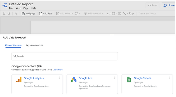
Let’s start by creating a new report in Data Studio as in the screenshot below.

Now let’s select ‘Google Analytics’
We should select the corresponding GA4 ‘Account’ and its ‘Property’. While Universal Analytics property has UA at the start of the tracking ID and Google Analytics has GA4.

Lastly, we can now click ‘Add to Report’. Our GA4 data source has now been added to our report.
How to transform GA4 data into visualizations
Data Studio is a powerful tool for visualizing fully custom dashboards and reports in which we can connect GA4 directly to show analytics data on different fitting charts.
Scorecards
First, we will see how easy it is to create scorecards using GA4 data in Data Studio.
Just add the Numeric field ‘New Users’ as a Metric value for scorecard visualization and measure comparison between the current specific period (Last 28 Days) and the previous period (Previous 28 Days) as given in the figure.

There are several periodic options on the Date range comparison as in the below figure. We can also customize the comparison date range by selecting the Advanced option.

Time Series Graph
Visualize a Time Series graph with numeric fields such as Users, New Users, Sessions, and Page Views displaying each day count of each audience added to the graph.

One main advantage of having direct GA4 data in Data studio is that displaying charts for different audiences based on age, gender, device, and acquisitions could be made effortless, just by one drag and drop.
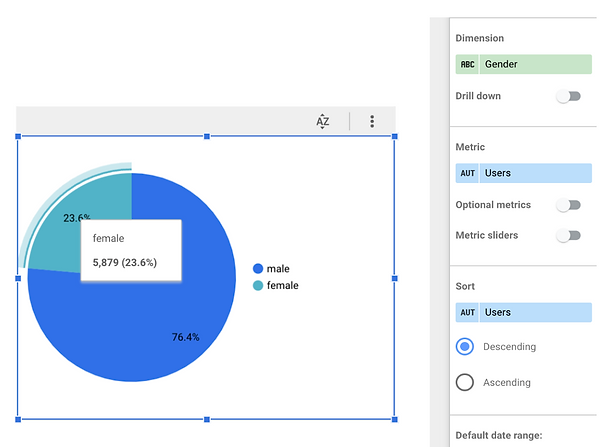
Pie Chart
Here we have used a pie chart for displaying the total number of users (number of users visiting your website) based on Gender. Select ‘Gender’ as Dimension and Users as ‘Metric’ value as in the screenshot below.
Displaying Pie Chart for the total number of users based on the acquisition channel (where the customer hits first to visit your website).

This chart visualizes the number of users based on Device Category which can be easily done by just clicking on the audience as ‘Device Category’ for dimension.

Bar Chart
Comparing Users and New Users audience counts based on the Age group by having needed metric values and dimensions as Age. The same can be done for different audiences as mentioned above for pie charts.

Map
Total number of users in different part of the world can be visualized using a Geographical map in the Data Studio by selecting dimensions such as Region, Continent, Country, and City-based on location granularity. Similarly, you can use other audiences such as new users, total visits, page views even total sales, revenue and much more.

Conclusion
And there you have it! I hope I have shown you how easy it is to use GA4 in Data Studio. We started out by connecting a GA4 property directly in Data Studio and we’ve also covered how to visualize GA4 raw data effortlessly using different charts in Google Data Studio. Even Data Studio supports all the custom metrics and dimensions of GA4. You can easily create your own dashboard for the GA4 property and share it with your colleagues.
.jpeg)