-p-130x130q80.png)
This article aims at introducing a free and open-source data visualization tool called RAWGraphs an open-source data visualization tool designed to make complex data easy to visualize.

We will discuss what it is recommended, what it is not for, and how to use it. Additionally, we will make use of our own dataset and RawGraphs’ sample datasets to create interesting graphs. Let's begin by getting to know what RAWGraphs is.
What is RAWGraphs?
RAWGraphs is an open-source web-based data visualization tool that can be used without downloading software. It is therefore possible to import data via the website and thus, customize the data visualizations. Designed to visualize large amounts of complex data as easily as possible. RAWGraphs aims to provide "a missing link between spreadsheet applications and vector graphics editors". This is an application that allows people without programming skills to produce visualizations without having to write code.
Based on the SVG format, RAWGraphs processes tabular data, i.e. spreadsheets and CSV. Data can be loaded in different ways.
- Simply paste your data or upload it
- Enter data directly from a website by entering a web address (URL) pointing to the data.
- Integration with SPARQL queries
In terms of output, it also allows for the export of visualizations as vector (SVG) or raster (PNG) images and imports them into another graphics editor. It is possible to embed them into web pages.
Note that, regarding security, the site emphasizes that even if the operations are carried out on the Web platform, there is no server storage.
Who RAWGraphs is recommended for?
RAWGraphs is the perfect tool for graphic designers and data visualization enthusiasts working with vector graphics software. The ability to create graphics based on data, color, and size, along with configuring each element represents a perfect base for any data visualization project designed in vector. Not only for print media but also to be embedded in web pages. The result obtained with RAWGraphs can serve as a starting point for further development with other software such as Adobe Illustrator.
How to use RAWGraphs?
The RAWGraphs logo is the first thing you see on the landing page, along with two options: “Use it now!” and “GitHub”. If you want to do the visualization directly on your browser, then “Use it now!” is the right choice. Bear in mind that this option requires a stable internet connection. However, if you want to run it locally on your machine, then you can fork it to GitHub. This option is recommended for those who have some familiarity with it.

In this article, we are going to show you how to use RAWGraphs on the browser. When you click on the “Use it now!” button it will take you to another page where you can choose how you prefer to load your data. The white space on the right side is where the uploaded data is displayed.
Step 1: Load your data
You can copy data from other applications such as MS Excel, GoogleSheets, or any other tabular or JSON data, and paste it onto the white space.

You can also test your data in RAW Graph without using your data. There are a few sample datasets that will enable you to create different graphs. It is also a good practice to know how the chart will look when you apply the data.

Let’s now upload data from a Spreadsheet. Simply pasting the columns that you need for visualization will make the data appear in the white space. You will also get a green button to confirm that your dataset is successfully parsed.

Step 2: Choose a chart
At this point, you can scroll down and look at the list of models that RAWGraphs offers. They have some ready-to-use templates and 27 different beautiful charts. Unquestionably, choosing the correct visualization model is not an easy task. You should understand your dataset and what you want to visualize. In our case, we have data that describes datadice staff’s predictions of the F1 team that would score the highest points from March to September 2022.

Step 3: Mapping
Let’s now visualize predictions of the number 1 team in 2022 using an alluvial diagram. Once the visualization model is chosen, you can scroll down to start mapping the dimensions you want to display in your graph.

On the left side dimensions that correspond to columns of your dataset are displayed in green buttons. To assign dimensions to chart variables all you need to do is drag and drop dimensions into the white space. Since the main objective of the Alluvial diagram is to visually link categorical variables with shared items, you should assign dimensions you want to correlate.

If we want to associate sizes with chart variables we can drag and drop a quantitative dimension into white space under Size. However, it is not mandatory to do so. Once you are satisfied with the dimensions to be mapped, you can scroll down to customize the graph.
Step 4: Customize
So at this stage, we can customize the graph the way we want it. At first, we have our graphic result by the conventional setting from the provider (chart 1). Afterward, we can make adjustments which display in chart 2.
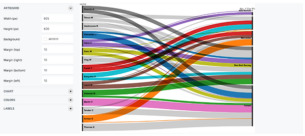
Chart 1

Chart 2
What Can You Generate Using Sample Data?
You can generate quite a number of exciting graphs using ready-made datasets. Now Let’s try out some graphs using sample datasets.
- Exploring the most populated cities in the world using circle packing.

- Visualizing hate crime victims in New York in 2020 using an alluvial diagram.

- The branches of the feline species in the wild and their risk of extinction using a circular dendrogram.

- Classification of wine aromas according to their roots using a sunburst diagram.

Conclusion
RAWGraphs is a perfect choice if the goal is to create a static output, such as a PowerPoint or pdf. What you create with RAWGraphs is, in other words, a static image. However, it is unsuitable for users looking for a tool to help them dynamically explore data. This graphic tool is enabled to connect to local files ´(formats i.e. .tsv, .csv, .dsv, or .json), or certain data from the web by entering a URL. Nonetheless, if you want to connect to your database, RAWGraphs is not the solution you are looking for.
All in all, RAWGraphs is a nice tool for easily creating graphics and exporting them in vector format. However, the fact that you can create static images makes it a less appealing option for BI enthusiasts.
Further Links
In this article, we introduced RAWGraphs, an open-source data visualization framework that makes complex data easy to visualize.
Check out our LinkedIn account, to get insights into our daily working life and get important updates about BigQuery, Data Studio, and marketing analytics
We also started with our own YouTube channel. We talk about important DWH, BigQuery, Data Studio, and many more topics. Check out the channel here.
If you want to learn more about how to use Google Data Studio and take it to the next level in combination with BigQuery, check out our Udemy course here.
If you are looking for help to set up a modern and cost-efficient data warehouse or analytical dashboards, send us an email at hello@datadice.io and we will schedule a call.
.jpeg)